Information Architecture
Wireframe + Prototyping
Digital Design / UI + UX
Technical Consulting
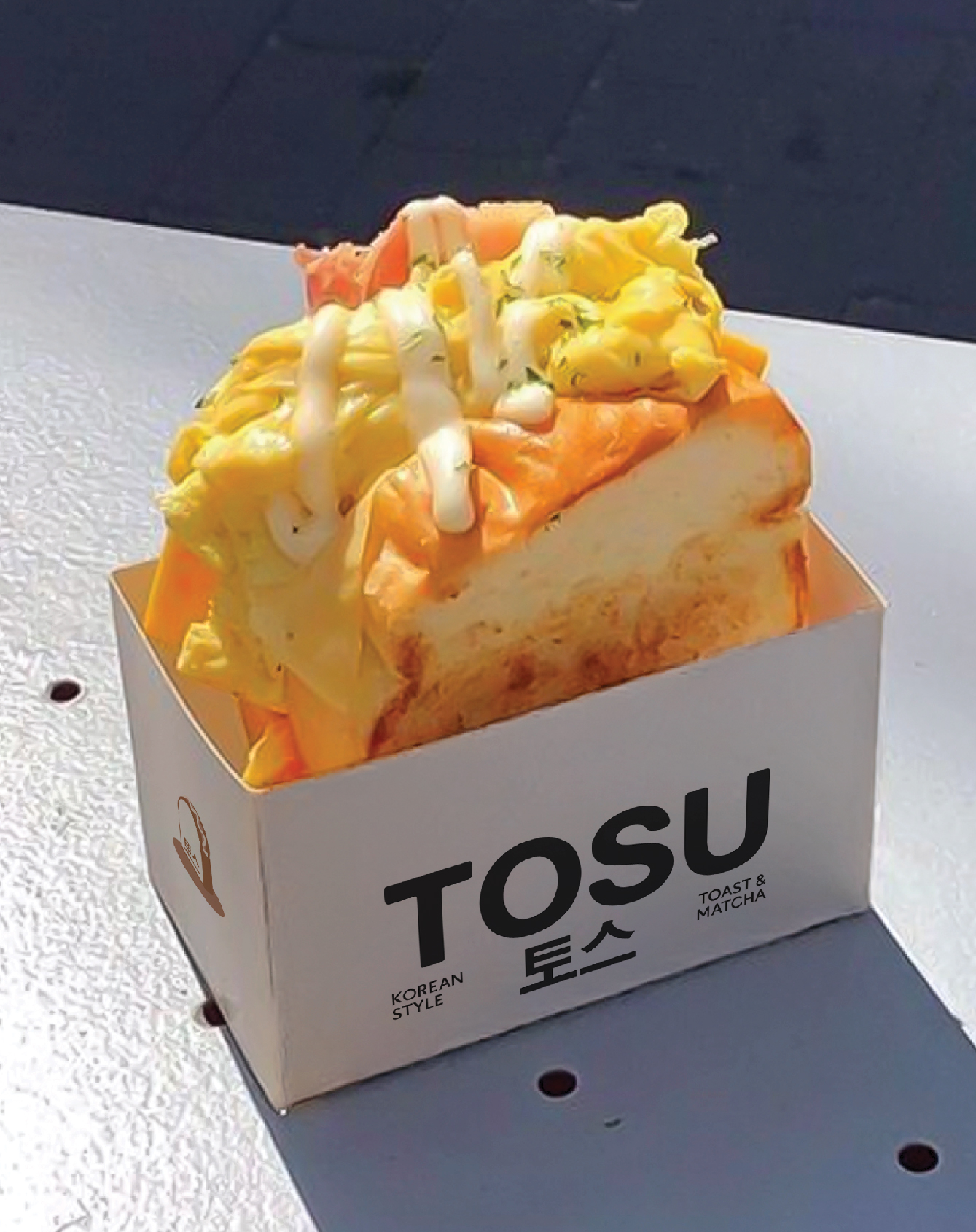
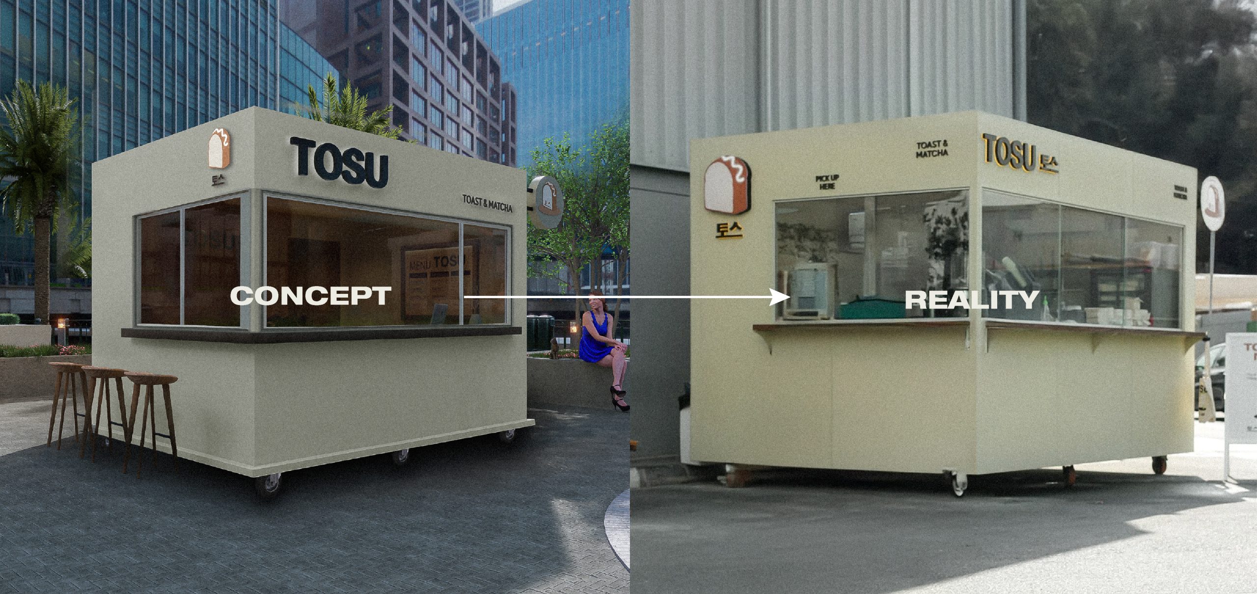
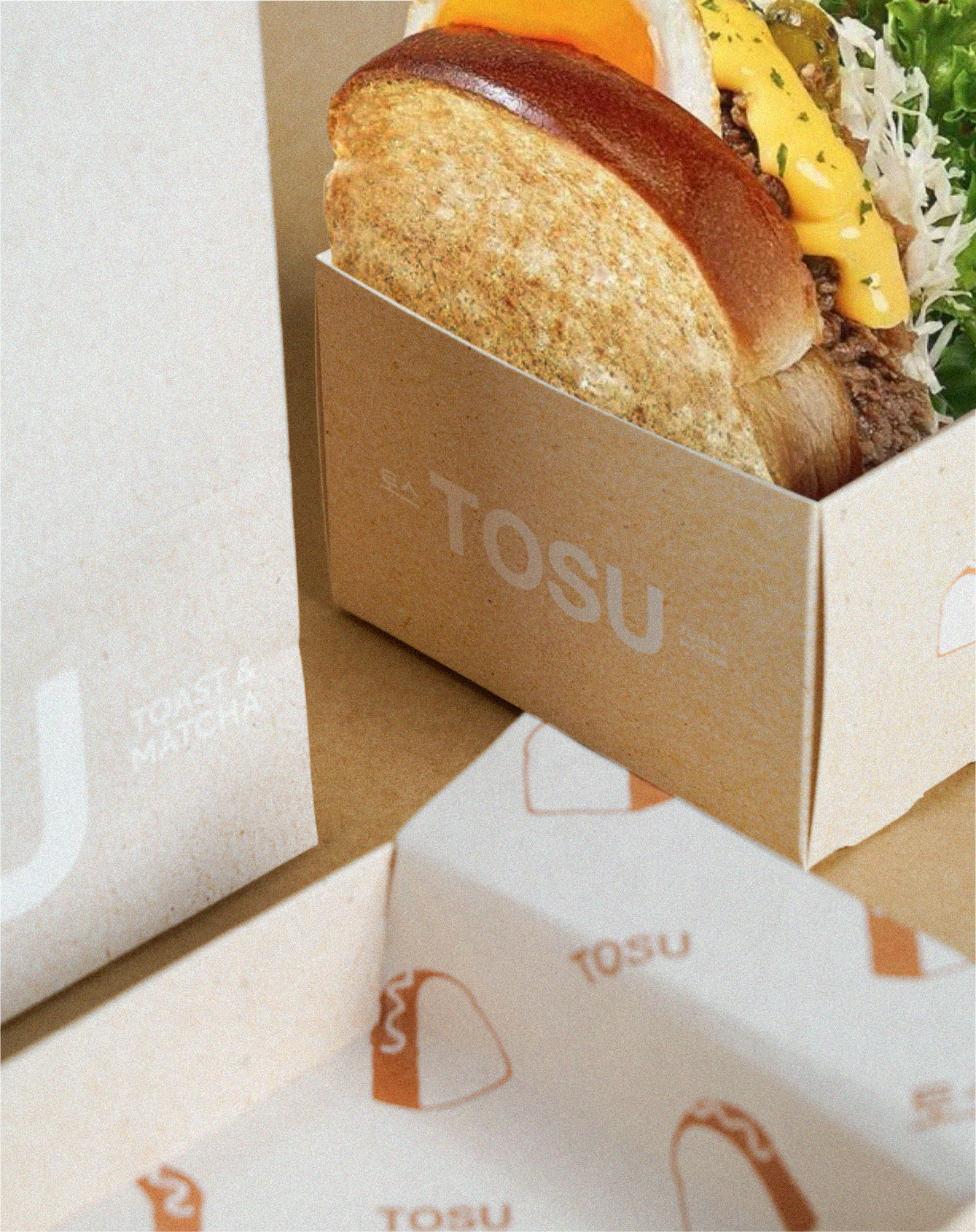
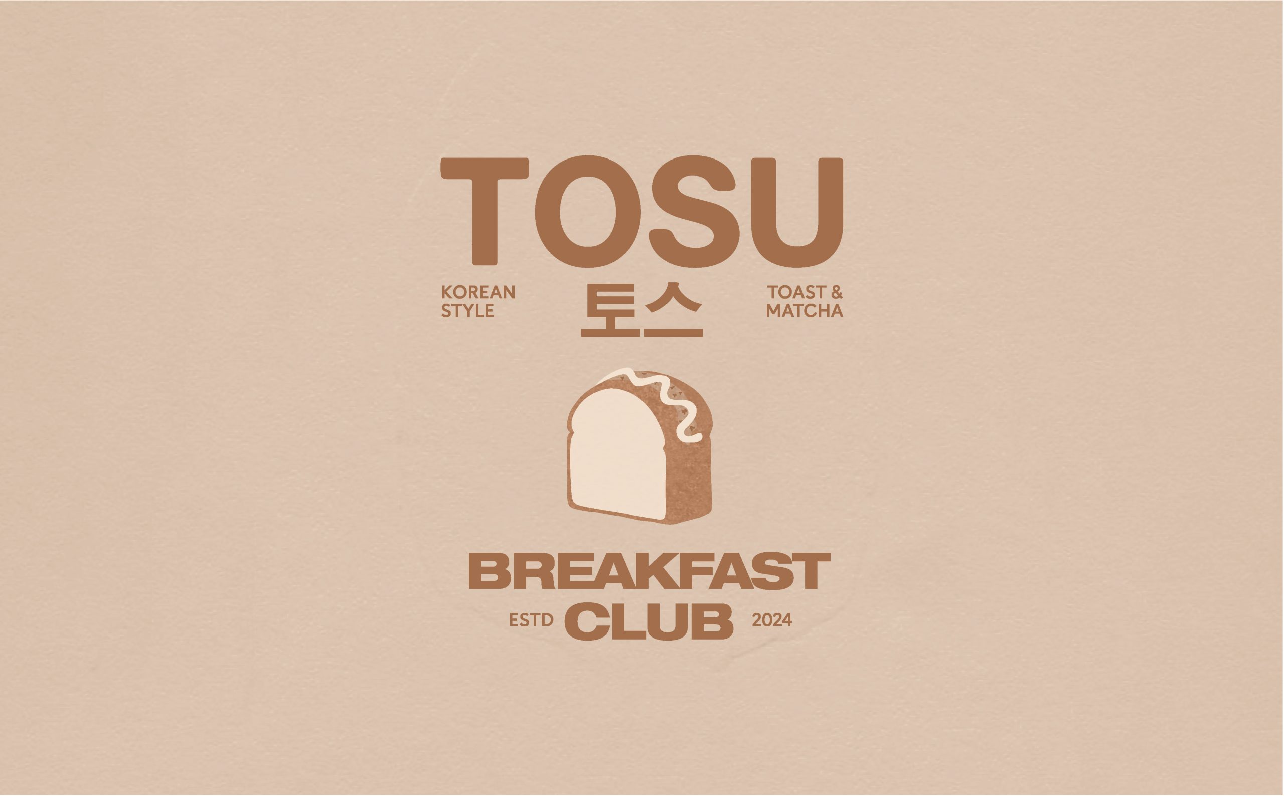
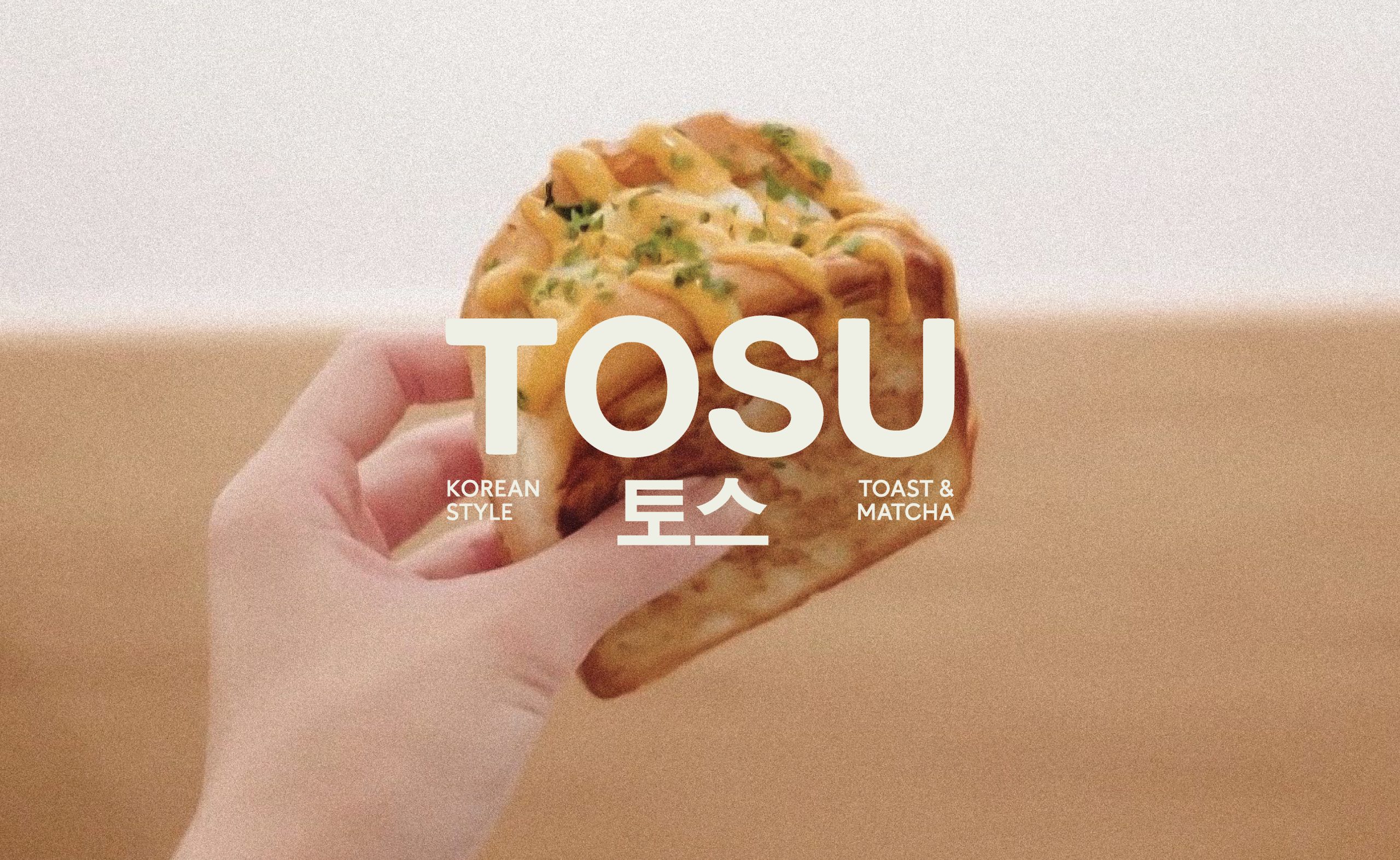
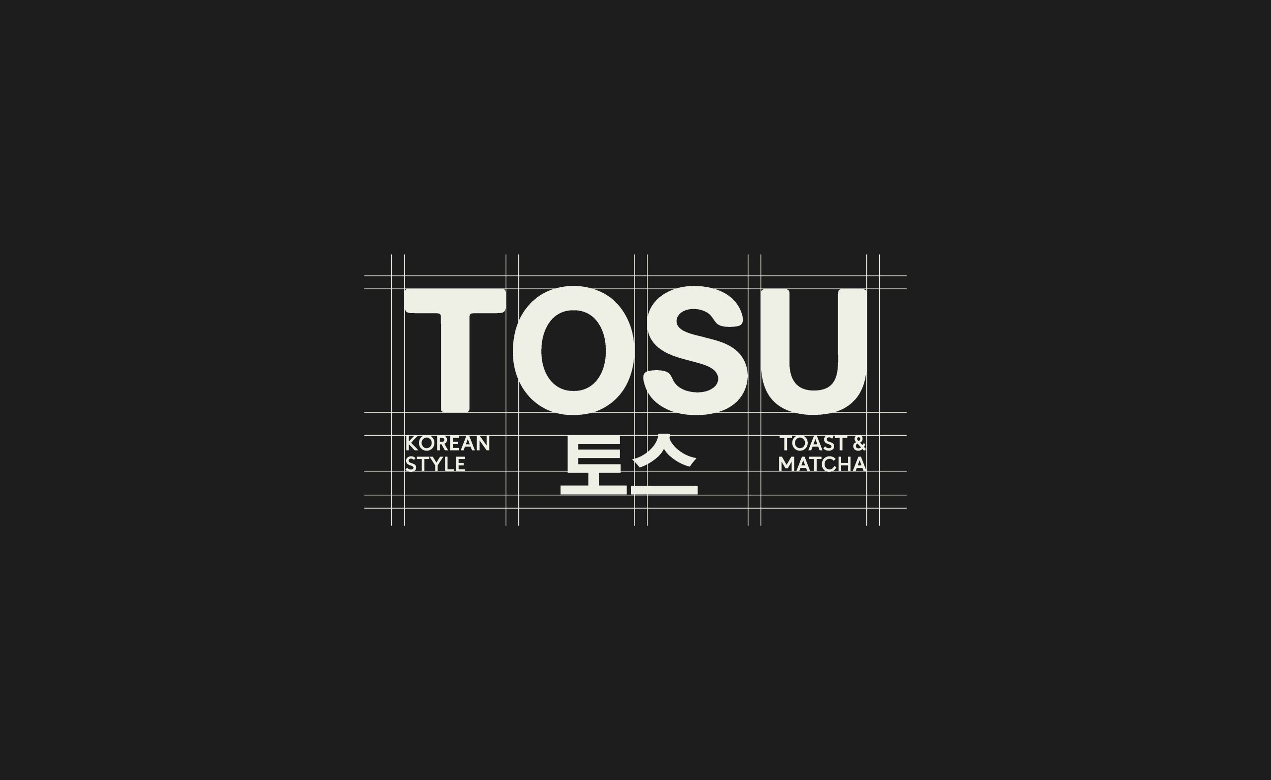
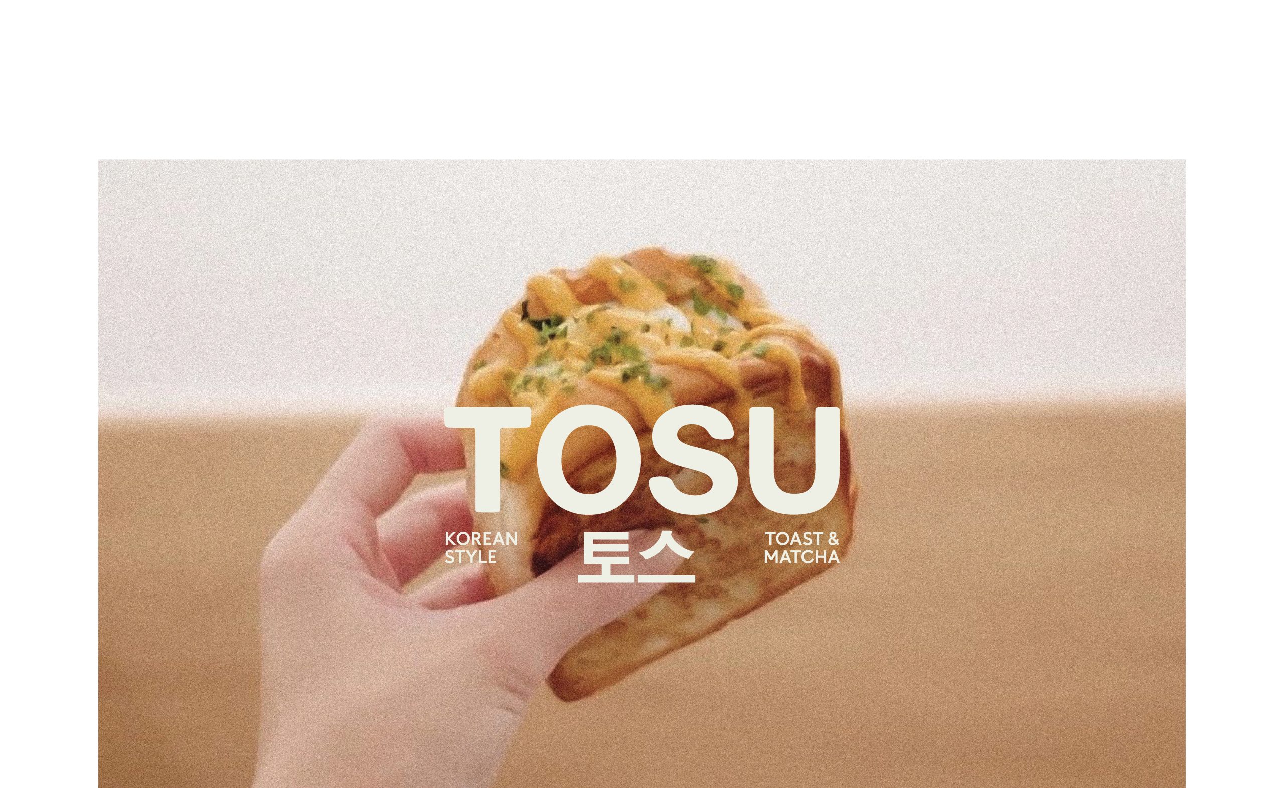
TOSU’s branding merges modern minimalism with traditional Korean aesthetics, crafting a distinct visual identity rooted in elegance and clarity. The design centers on clean, bold typography and a refined color palette, brought to life through subtle textures and warm wooden accents.
At the heart of TOSU’s concept is “Korean Style Toast & Matcha” a serene yet vibrant culinary experience. The branding reflects this balance: minimalist in form, yet rich in cultural nuance. The result is a space that feels both contemporary and welcoming, designed to resonate with an urban audience looking for something refreshingly different.
To create a modern brand identity rooted in Korean aesthetics, centered on toast and matcha.
To create a distinctive visual identity that seamlessly merges modern minimalism with traditional Korean aesthetics, positioning TOSU as a contemporary lifestyle destination centered around Korean-style toast and matcha. The branding should evoke elegance, warmth, and cultural depth through clean typography, a refined color palette, and natural textures—resonating with urban audiences seeking a calm, design-led culinary experience that feels both authentic and refreshingly different.
NAVIGATION
Through close collaboration with their in-house team, we created an elegant navigation / filter structure, making it easier for users to find and browse product.